How Laura's website helped her book 30 photography clients
I liked Laura from the moment we met.
She had left a steady corporate gig to start her own business. She had traveled around India. She knew all the words to the Broadway show Hamilton.
She had guts, grit, and good taste in musicals.
She also had a problem.
Her DIY website wasn't helping her book clients. It was difficult to use and didn't match the quality of her services.
So, we got to work crafting a new site that would make her clients feel confident in their choice to hire her.
In Laura's own words, here's the story of what happened next.

☝Pin for later
Want a website that helps you book clients? Get my free masterclass and learn the secrets to a simple website that sells your services!

Cami, website designer

laura, photographer
Cami: Why did you start your business?
Laura: I worked at a desk job for so long and it didn't fulfill me creatively. I started my business because I always wanted to be in the arts, to capture moments and memories, not just photographs.
Cami: Before working together, what was your biggest struggle?
Laura: I felt like my old website didn't match the quality of my photographs and it never worked like I wanted it to, especially on mobile. I want my clients to feel confident in their choice to hire me and for the whole process to be easy and comfortable. My old website wasn't creating that feeling.
“I want my clients to feel confident in their choice to hire me and for the whole process to be easy. My old website wasn’t creating that feeling.”

Laura’s old homepage
Cami: How did working together help solve that problem?
Laura: I might have been overly emotional, but I started crying when I saw my new site. It's everything and more!
Also, I got new clients! After launching I had a photoshoot and my new clients said "we felt like we knew you coming in today. Your site answered all of our questions and was so easy to navigate. We knew we wanted you the minute we clicked on your site."
I never thought I would be able to pay my rent doing what I love, but I can. I had 30 shoots this month! 30! How did that happen? My new website is what happened.
“I got new clients! After launching, I had a photoshoot and my new clients said we knew we wanted you the minute we clicked on your site.”

Laura’s new homepage
Cami: We launched your new site a year ago. How have things changed since then?
Laura: Oh my gosh! Seriously?! It doesn't feel like a year at all. I can't believe you helped me make my dreams come true. I wouldn't be where I am today without this website.
You believed in me and made me realize my worth as a photographer and small business owner. Thank you doesn’t even begin to cover it.
“I wouldn't be where I am today without this website.”

Laura’s website helped her book new clients
5 reasons why Laura’s website works so well
After launching her site, Laura had a photoshoot and her new clients said…
“We knew we wanted you the minute we clicked on your site."
The fact that Laura’s clients felt this way wasn’t an accident — it was the result of intentional choices we made throughout the web design process.
Let’s take a look at 5 reasons why Laura’s website works so well.
Reason 1: Laura got clear on her ideal clients

Laura is clear on who her ideal clients are
Before you can build a site that helps you book clients, you need to figure out exactly who those clients are. Who is your website for and what do they need from you?
Through working together, Laura got clear that her ideal client is a busy working mom. She is proud of the life she’s built for her kids, but worries about missing out on time with them. She values Laura’s services because Laura’s photos help her capture joyful moments with her family.
Laura’s clients come mainly through referrals. When a prospect lands on her website, they’re looking to get to know her better. They want to learn about her packages and pricing, see samples of her work, and make sure that she’s trustworthy — someone they’d want around their kids.
From there, I was able to craft a website that meets the needs of Laura’s ideal clients.
Reason 2: Laura’s site is built around her business goals

Laura's site is built around her business goals
As a service-based business owner, Laura’s main goal is to book clients through her website. To help make that happen, we did three things:
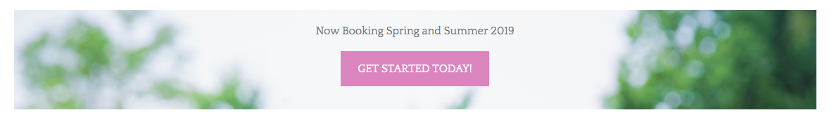
We decided which pages would be most useful to her ideal clients. These pages were: home, portfolio, about, FAQ, packages, and contact.
We planned out how we would guide visitors to action. Laura decided that she’d like future clients to get in touch by filling out her contact form, so we mapped out a few paths people might take to get there. For example: home —> portfolio —> packages —> contact.
We included a strong call to action on every page of her site. “Get started today!”
Reason 3: Laura’s site is easy to navigate

Laura’s main navigation helps her clients find what they need quickly and easily.
Each page on Laura’s site has a name that’s easy to understand. There’s zero overwhelm or confusion, which helps put her clients at ease. Navigating Laura’s site is a stress-free experience and it makes it simple for clients to hire her.
Here are the pages we decided to include in her main navigation:
Home
Portfolio
About
FAQ
Packages & Investment
Contact
We also included a footer navigation on every page of her site so that her visitors never feel lost:

Reason 4: Laura’s site answers all of her client’s questions

Before hiring someone, it’s normal to have lots of questions.
The problem is, as a client it can be awkward to ask everything that’s on your mind. You don’t want to inconvenience the person you’re talking to, or risk them thinking that you’re asking “dumb” questions. You might even have questions you have that you haven’t even thought to ask yet!
As a service-provider, it’s a good sign when your prospects ask questions.
The problem is, you end up answering the same questions over and over again and it takes forever to go back and forth discussing every little detail over email.
To solve this, I created a detailed FAQ page for Laura’s site.
Laura’s FAQ page is organized by category to make it simple for her clients to find the information they need. Here are the categories we decided to include:
General FAQ
Digital files, image + equipment questions
Family photography questions
Newborn photography questions
Cake smash + party questions
Headshot questions
Laura’s FAQ page is incredibly helpful for her future clients. The neat, organized design makes it easy to find information. Her ideal clients can get all their questions answered in one place and it makes them feel confident in their decision to hire Laura.
Reason 5: Laura’s site looks great on mobile
According to Statista, in 2018 more than 52 percent of all website traffic worldwide was generated from mobile phones.
That same year, Google officially announced that they would be using mobile-first indexing. Google now rewards sites that work well on mobile and penalizes sites that don’t.
On social media networks like Facebook and Instagram, mobile use is even higher. As of January 2019, Statista reported that 96 percent of Facebook users accessed their accounts using a mobile phone rather than a tablet or desktop.
In other words, if your website doesn’t work well on mobile, you’ve got problems!

Here’s what I did to make sure Laura’s site works well on mobile:
The text can be read without having to zoom in
The page layouts automatically adjust to different screen widths
There’s no horizontal scrolling
Buttons are big and easy to click
Laura does most of her marketing through Facebook and Instagram, which means that lots of people are coming to her site through their phones. To help Laura book clients through her site, I paid close attention to the mobile experience.
(ps. need tech help? Click here to read The Ultimate Guide to Creating a Website for your Business — even if you’re not tech-savvy!)

“I never thought I would be able to pay my rent doing what I love, but I can. I had 30 shoots this month! 30! How did that happen? My new website is what happened.”
— Laura Yost
If you’re feeling inspired by Laura’s results, know that you can do the same thing. Her results weren’t an accident — we designed them!
Design is a learnable skill. With the right guidance, you can create a website like Laura’s that helps you book clients and build trust. That’s what I teach my students how to do inside my course Simple Site Blueprint.
Whether you’re just starting out or you already have a website, Simple Site Blueprint will teach you how to create a sleek, strategic site that has your future clients saying “we knew we wanted you the minute we clicked on your site.”
Good design isn’t magic, but it sure can feel that way.

Want a website that helps you book clients? Get my free masterclass and learn the secrets to a simple website that sells your services!
Like this post? Share it out!